Luseta Beauty, A minimal skincare
brand identity
A conceptual brand system exploring how premium skincare can feel soft and approachable without becoming generic. Built across logo, stationery, packaging, digital, and social formats.
Project overview
Premium but approachable. Calm but not cold.
This self-initiated project explored how a skincare brand could feel both luxurious and everyday, premium enough for a gift shop, approachable enough for a morning routine. The challenge was avoiding the two traps of beauty branding: the stark clinical white of medical skincare, or the overly decorative pink femininity of mass-market products.
Details
Type Conceptual / self-initiated
Scope Logo · stationery · packaging · digital
Market Premium skincare · Paris, France
Tools Illustrator · Photoshop · Figma
The colour system
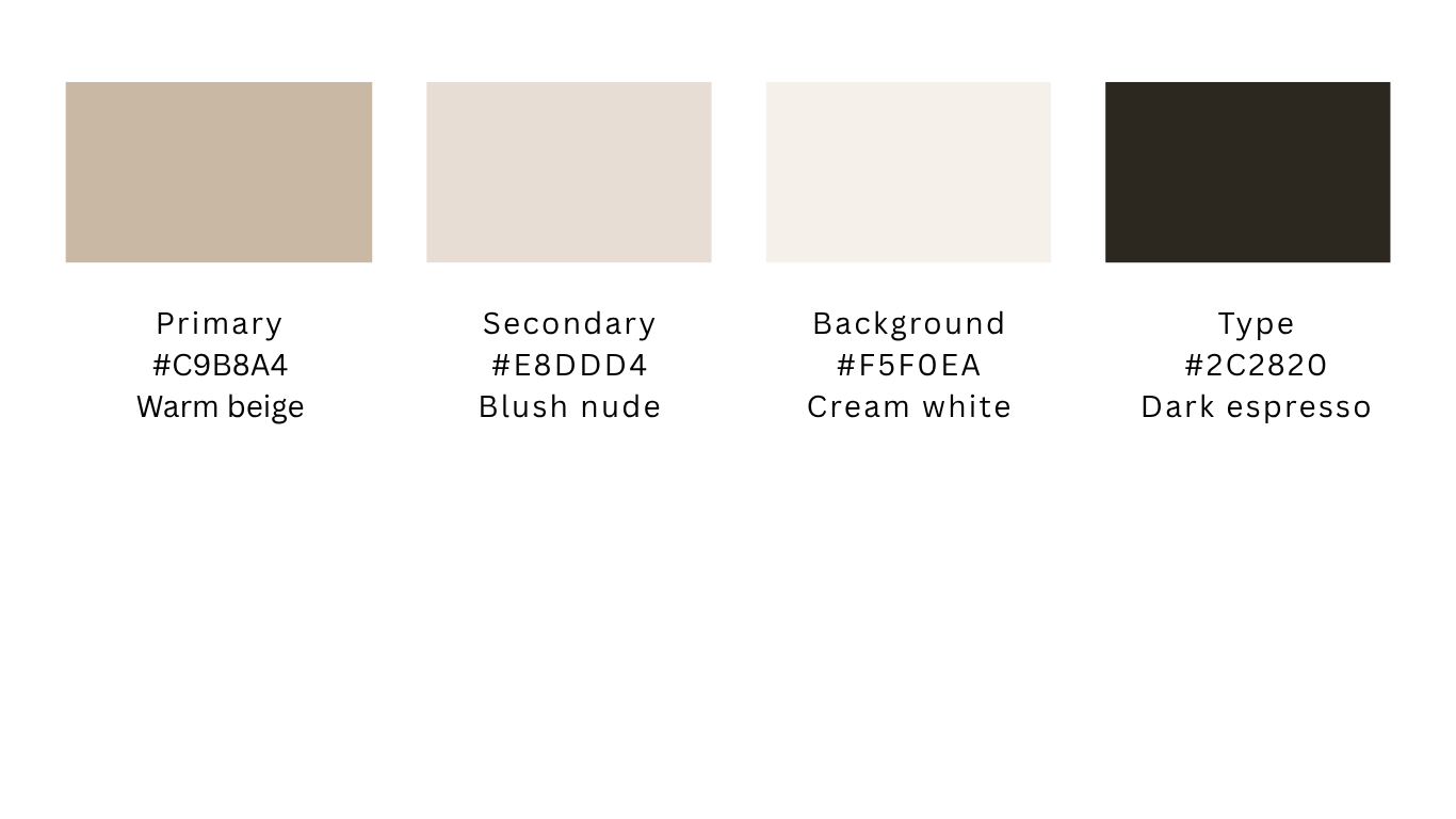
A warm neutral palette built from four tones. No pink, no clinical white, no loud accent colour — just the warmth of natural materials. The palette communicates calm, softness, and quality without shouting.
The system
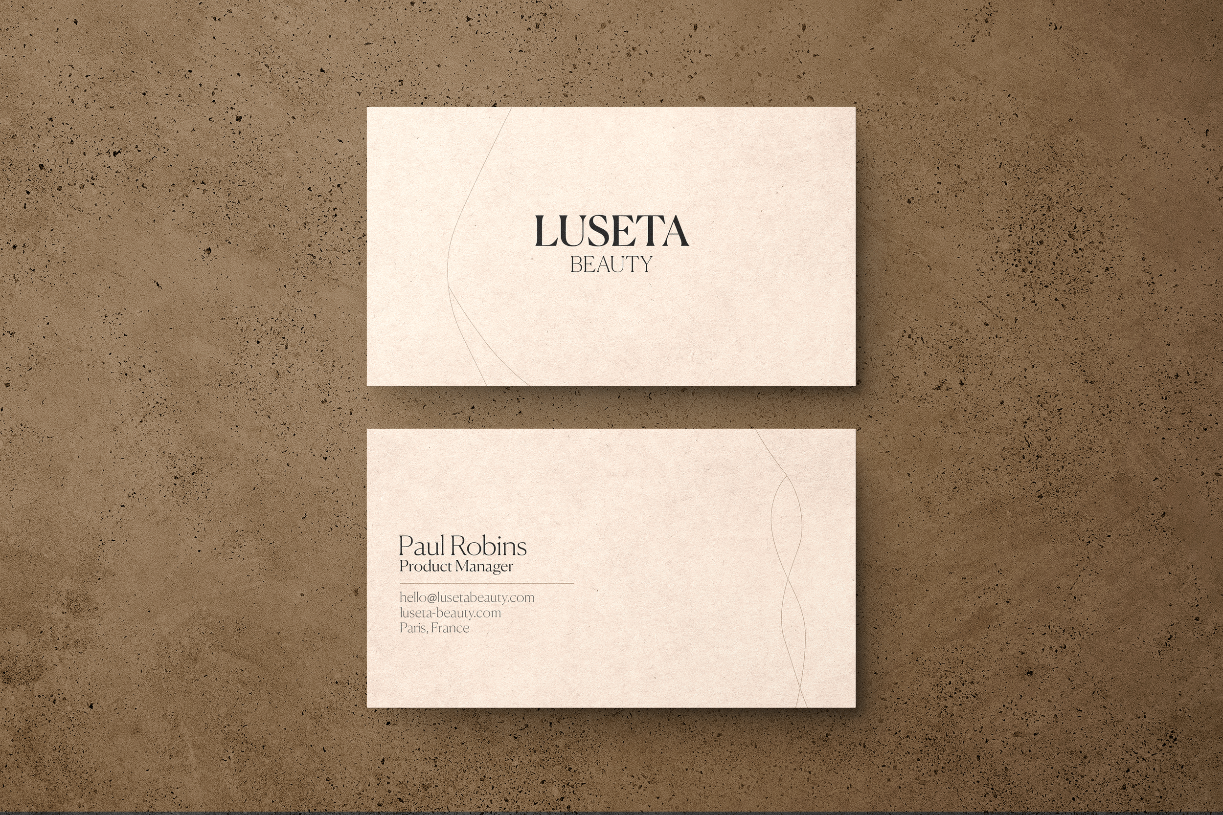
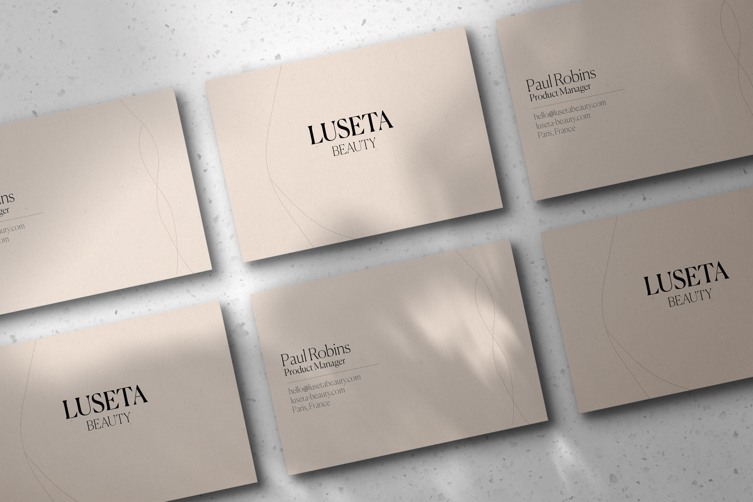
Logo & stationery
Business cards · letterhead · brand mark
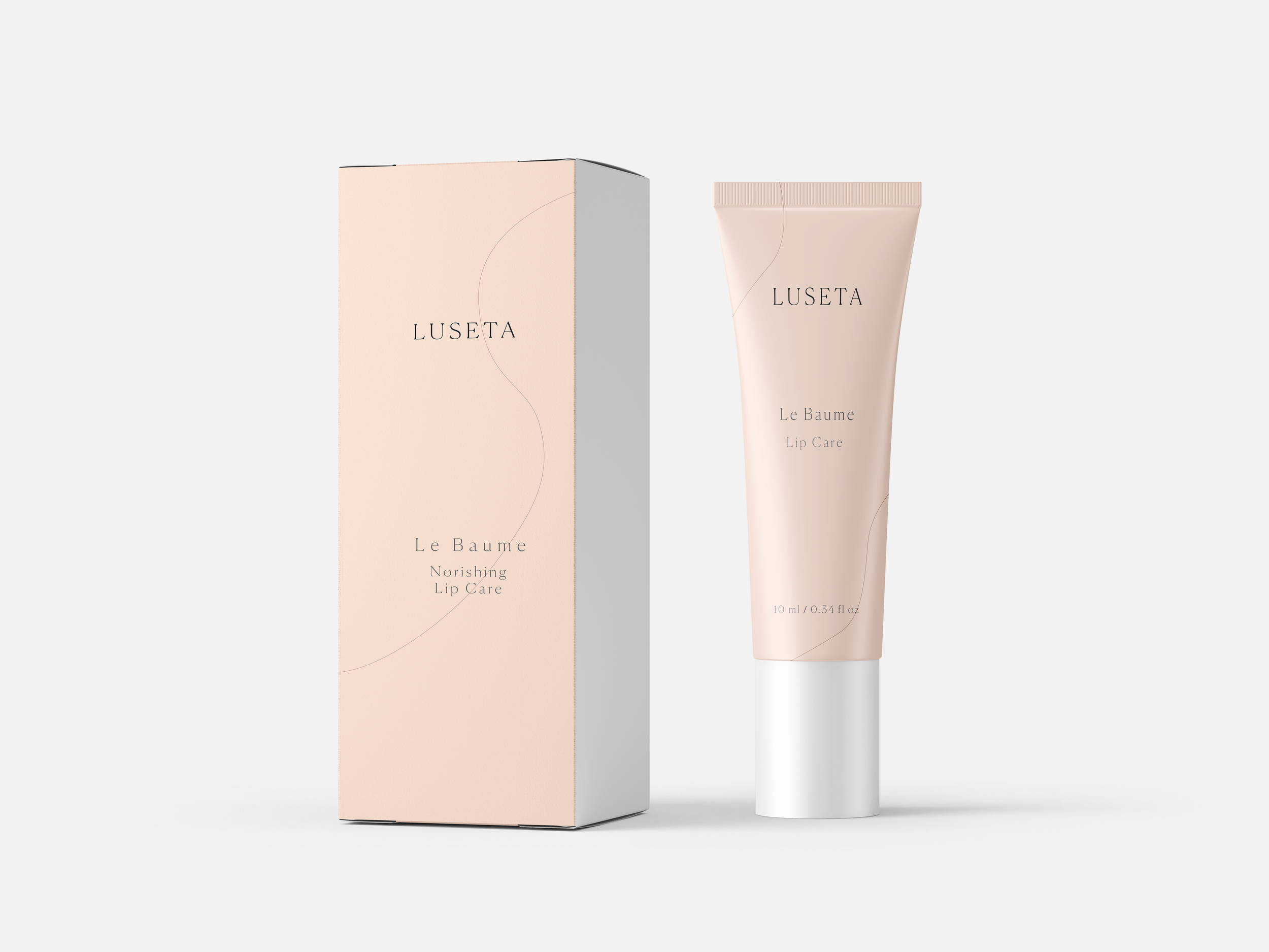
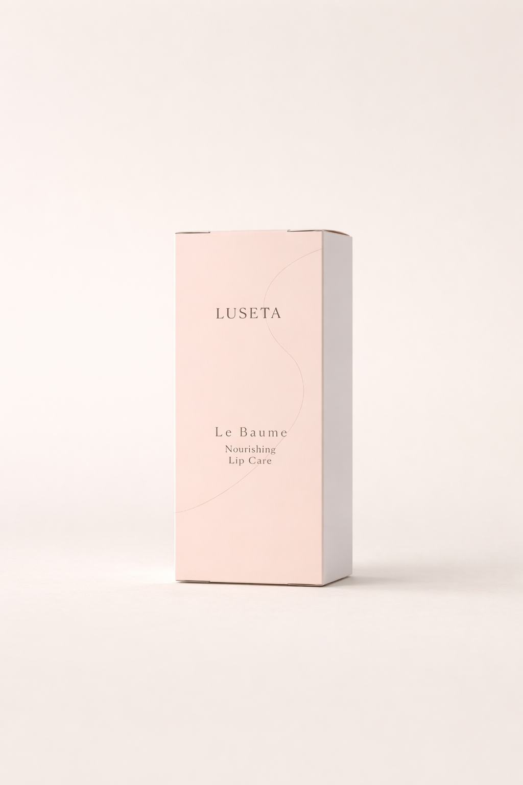
Packaging
Product box · lip balm tube · shopping bag
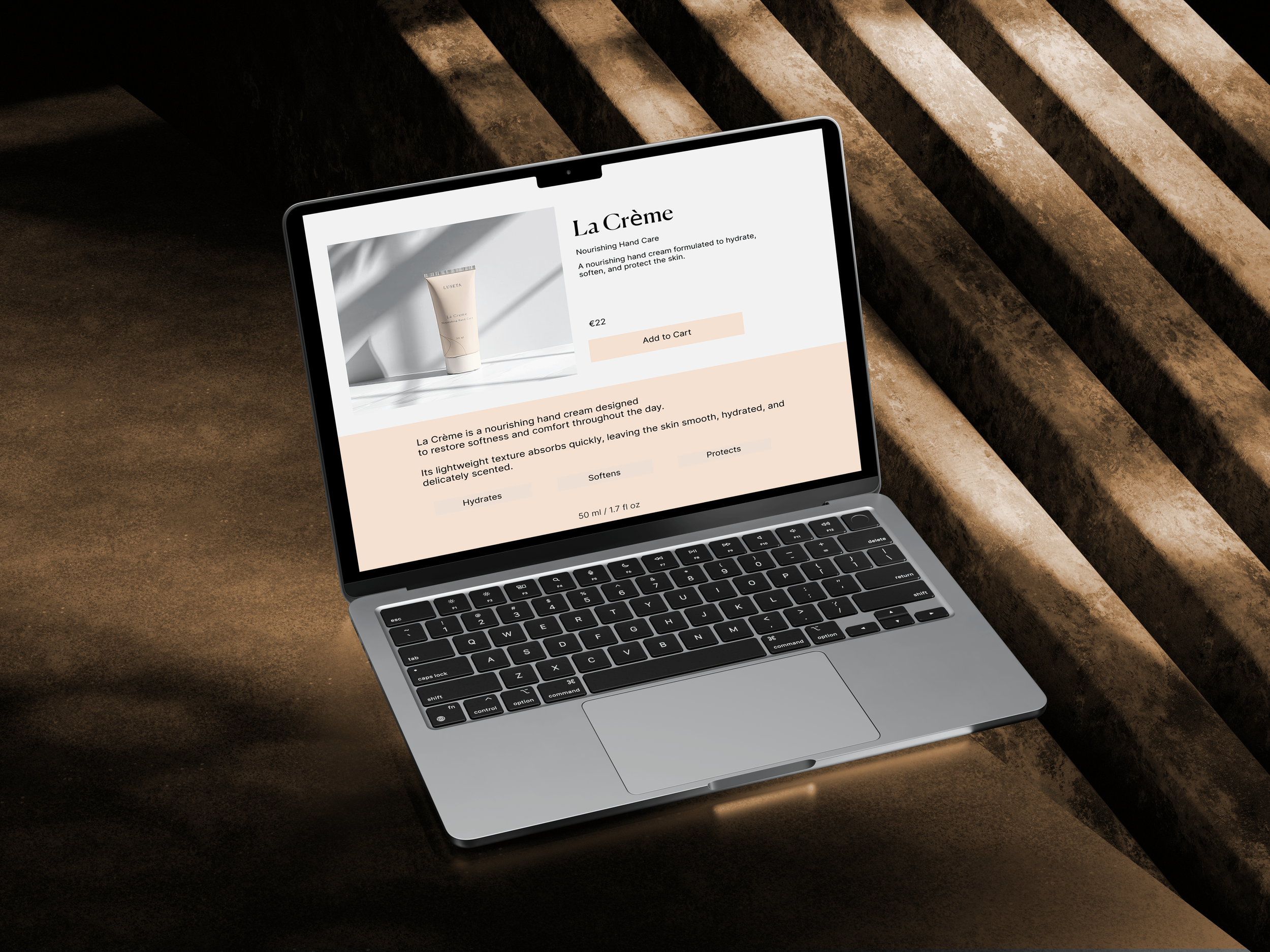
Website
Product page · e-commerce layout
The design decision
Restraint is the luxury.
The typography uses a single serif — wide letter-spacing, light weight, never bold. No decorative elements, no illustration, no pattern. The brand mark is just the name, set beautifully.
This restraint is the whole point. When everything around you is loud and decorated, being quietly confident is what makes you stand out.
-
Single serif · wide tracking · light weight · never bold
-
Subtle organic line element · references natural plant forms · never decorative
-
Premium daily skincare · Paris market · €20–50 price point
IMAGES


"When everything around you is loud, being quietly confident is what makes you stand out."
Conceptual brand identity · self-initiated · 2025